21. Musical sounds
Summary
Music versus noise
There’s a practically infinite number of combinations of different frequencies and amplitudes of sound. Some of these combinations may sound pleasing to us, and others may not. Usually, we categorize the pleasing sounds as musical sounds. Perhaps you consider jazz, classical, rock, or rap to be musical. Other sounds that are not pleasing can be categorized as noise. This might include sounds such as banging together pots and pans, dropping a hammer on the floor, or scratching fingernails on a blackboard.
What is it that distinguishes music from noise? To a certain extent, this is a subjective question that depends on the person listening to the sounds. You may consider certain types of sounds to be musical, whereas someone else might consider them to be more like noise.
From a physics perspective, we can broadly categorize different types of sounds as either music or noise based on the types of frequencies contained in the sound. Most sounds are not pure tones consisting of only a single frequency of sound waves. Instead, they are the combination of a few, or sometimes many, tones combined together.
Using a concept called Fourier analysis, we can look at the different frequencies that make up each sound. The mathematics behind Fourier analysis is very complicated and is outside the scope of this textbook. But the conceptual idea is that Fourier analysis decomposes a wave into each individual frequencies that make it up. A graph of a Fourier analysis therefore plots the amplitude of a wave on the y-axis and the frequency of the wave components on the x-axis. Frequencies that have a large amplitude are more well-represented in the wave than frequencies that have a small amplitude.
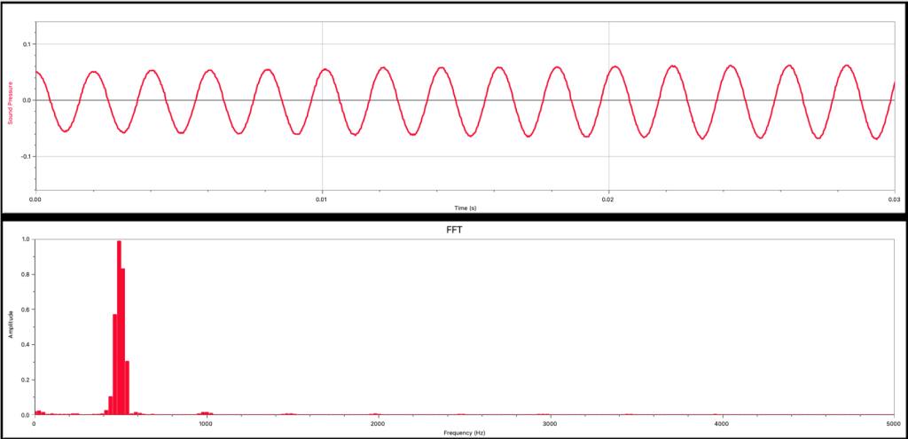
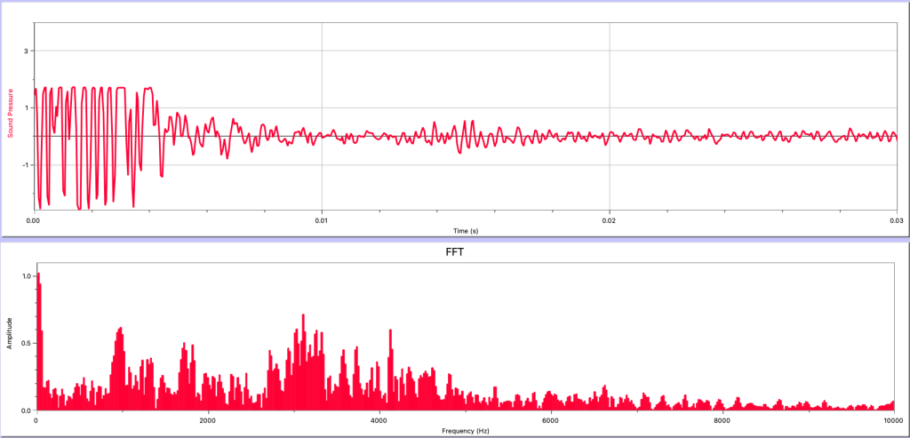
A tuning fork is designed to produce a single frequency of sound, although other harmonics can be created in the tuning fork, just as a string can support multiple standing wave harmonics. Figure 21.1 shows both the graph of the sound pressure of the wave generated by the tuning fork as it changes through time (top) as well as the Fourier analysis of the wave (bottom). The Fourier analysis of the tuning fork shows a single predominant peak at 490 Hz, the same frequency that is stamped on the side of the tuning fork. A few other harmonics exist at greatly reduced amplitudes (the second harmonic is a very small bump at 980 Hz, and the third harmonic at 1470 Hz is barely perceptible on the graph). This is consistent with the sound pressure graph that shows a single oscillating wave at a frequency of 490 Hz.
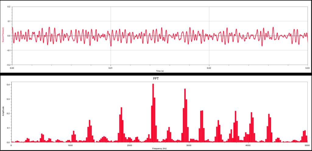
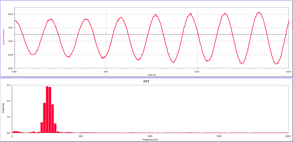
The graphs in Figure 21.2 were generated by a piano playing a single musical note. The sound pressure vs. time graph (top) shows a wave that is more complicated than that of the tuning fork, but it is still possible to see periodic oscillations in the graph. The Fourier analysis graph (bottom) shows that the piano does not produce one single frequency of sound wave. There are more frequencies of waves represented in this sound compared to the tuning fork. However, the frequencies that do exist in the Fourier analysis are periodic. That is, they are spaced out at regular intervals.
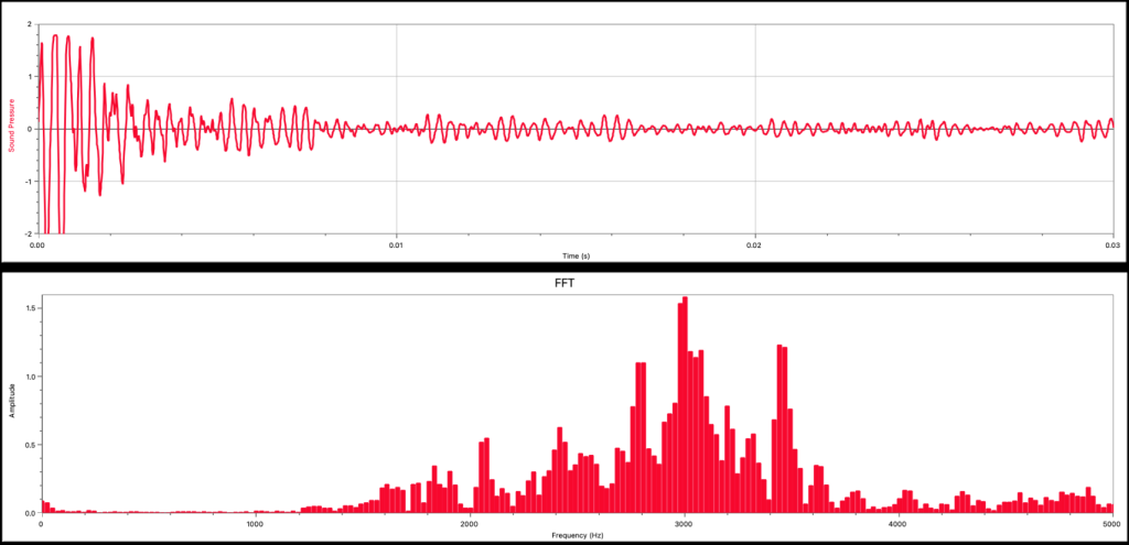
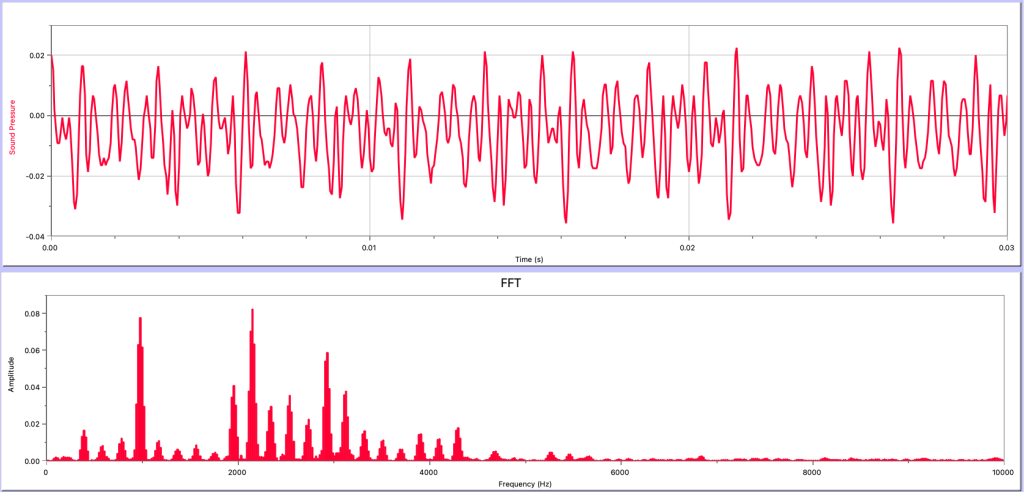
The graphs in Figure 21.3 are for a more “noise”-like sound, created by Dr. Pasquale snapping her fingers. The sound pressure vs. time graph (top) shows a very complicated wave that has many strong oscillations at the start of the sound, followed by many other oscillations. The Fourier analysis (bottom) shows the frequencies of the sound wave generated by the snapping sound. There are many frequencies present in the sound wave, and they have no periodic spacing or clear pattern to them. This Fourier analysis shows a very random spread of frequencies.
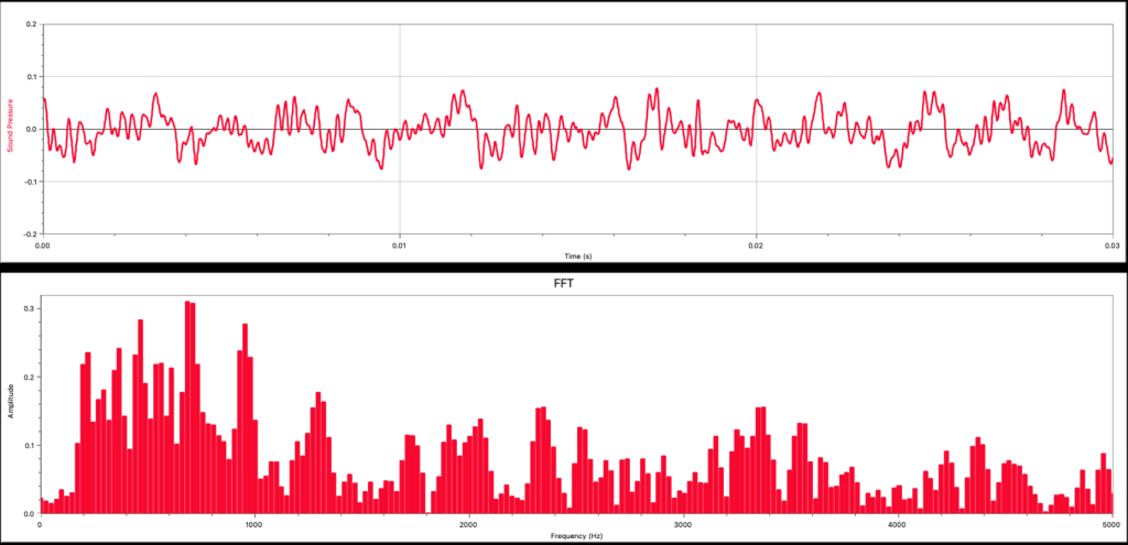
Finally, the graph in Figure 21.4 shows the sound pressure vs. time graph (top) and Fourier analysis (bottom) for the sound generated by a white noise machine. The white noise machine creates many different frequencies of sound. The sound pressure vs. time graph is very messy looking, and the Fourier analysis shows a very broad spectrum of frequencies that are represented in the sound wave.
What conclusions can we make from these graphs? Generally speaking, musical sounds, such as the tuning fork and piano, consist of just a few frequencies of sound waves. We call this type of Fourier analysis discrete. Discrete just means that there are only a few particular frequencies that predominate. Sounds that we consider to be noise have very continuous, broad, or random frequency distributions in their Fourier analysis.
One last comment about musical sounds. Musical instruments are designed to support different standing waves and create sounds at different frequencies. For example, the note “middle C” has a frequency of 256 Hz. If there are five different instruments all playing middle C at the same frequency, what is it that causes each instrument to sound different?
In fact, each instrument will have a slightly different Fourier analysis. The exact frequencies that make up any particular musical note will be a little different from any other instrument. This characteristic is called timbre. It has to do with the design of the instrument, the materials it is made from, and how many harmonics are created in the instrument.
Loudness versus intensity
Loudness has to do with the subjective quality of the amplitude of a sound wave. Perhaps you like to turn the volume all the way up, and consider that to be the best level of volume for listening to music. Somebody else may consider that same volume to be too loud. For a single individual, loudness is related to the intensity of a sound wave, but among individuals, loudness is not something that can be agreed upon.
On the other hand, intensity describes the amount of energy per unit of area that reaches a certain location every second. In other words, it is equal to the amount of power divided by the area over which that power is distributed. Intensity is an objective, physical quantity that we can measure. The units of intensity are W/m2. It is related to the energy that is transmitted by the sound wave. (In fact, intensity can be measured for all waves, not just sound waves.)
The human ear is capable of hearing sounds that are both very quiet and very loud. This means that the values of intensity that we can hear go from extremely small numbers to extremely huge numbers. The lowest intensity sound that an average human ear can hear is 10-12 W/m2. That is: 0.000000000001 W/m2, an extremely small number. On the other end of our ability to hear, a rocket engine has an intensity of 106 W/m2. That is: 1,000,000 W/m2, a very large number. Between these two values represents a huge range of intensity values that we can hear.
For this reason, using intensity values is not the best way to describe sound intensity. Instead, scientists use a relative scale. In other words, how much more intense is one sound compared to another? To determine the relative intensity of sounds, we divide by a baseline value. For sound waves, the baseline that is used is known as “the threshold of human hearing,” which is 10-12 W/m2. Using this value, we can see how much more intense one sound is compared to that threshold. The threshold of human hearing has a relative intensity of one (it is exactly equal to itself). The rocket engine has a relative intensity of

This method (using a relative scale) has eliminated very tiny numbers from being present when determining the loudness of sounds, but it still encompasses an enormous range of values from quiet (1) to loud (1018 or higher).
To solve this issue, we use a logarithmic scale to discuss intensity. The logarithm just looks at the exponent of the power of ten, and ignores the base (that number ten that we’re taking a power of). In addition, we multiply that logarithm by the number 10. This is known as the decibel scale. The table below shows several different values of intensity, the relative intensity compared to the threshold of human hearing, the logarithm, and the logarithm multiplied by 10.
|
intensity |
relative intensity |
logarithm |
10*logarithm |
|
10-12 |
1 |
0 |
0 |
|
10-10 |
100 |
2 |
20 |
|
10-8 |
10,000 |
4 |
40 |
|
10-6 |
1,000,000 |
6 |
60 |
|
10-4 |
100,000,000 |
8 |
80 |
|
10-2 |
1010 |
10 |
100 |
|
100 |
1012 |
12 |
120 |
|
102 |
1014 |
14 |
140 |
|
104 |
1016 |
16 |
160 |
|
106 |
1018 |
18 |
180 |
The logarithm multiplied by ten is known as the decibel scale. Many common sounds can be represented by their decibel (dB) value. This scale solves the problems represented by using intensity and relative intensity by creating a scale that generates values between 0 dB and about 100 dB for common sounds. The table below gives the intensity in both W/m2 and decibels for several common sounds.
|
description |
intensity (W/m2) |
intensity (dB) |
|
threshold of human hearing |
10-12 |
0 |
|
rustling leaves |
10-11 |
10 |
|
whispering |
10-10 |
20 |
|
“normal” conversation |
10-8 – 10-6 |
40 – 60 |
|
vacuum cleaner |
10-5 |
70 |
|
heavy traffic |
10-3 |
90 |
|
riveter |
10-2 |
100 |
|
loud rock concert |
100 |
120 |
|
jet airplane |
103 |
150 |
|
Rocket engine |
106 |
180 |
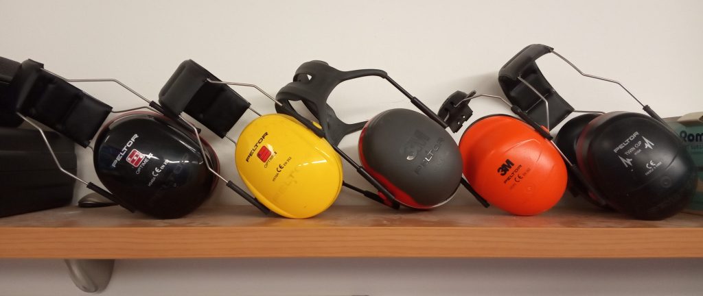
At a certain level of intensity, around 85 decibels, our ears will become damaged. People working around loud noises for long periods of time need to wear earplugs or headphones to protect their hearing. If we’re going to be exposed to relatively low intensity noises for short periods of time, earplugs may be sufficient. For longer exposures, or for more intense noises, such as working around jet engines, earmuffs (Figure 21.5) may be needed.
At intense enough levels, sound waves can cause physical pain, which occurs around approximately 120 decibels. Above this level, it is very important to wear protective equipment on our ears!
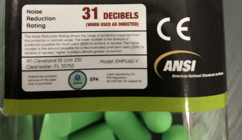
Earplugs are used to decrease the intensity of sound. Usually on the label of a package of earplugs is a decibel value that is included (Figure 21.6). This indicates how much the decibel level will decrease. If you’re using a gas-powered leaf blower with an intensity of 90 dB, wearing 30 dB earplugs will reduce the intensity to 60 dB.
How much more intense (louder, if you will) is a rocket engine compared to a jet engine? This question of “how much louder” becomes slightly difficult to answer when using a logarithmic scale. A logarithm tells us the exponent on the number ten. In other words, it tells us how many zeros are after the one in a number. A jet engine is 150 dB. Something with an intensity of 160 dB is 10 times more intense than the jet engine. Something at 170 dB is 100 times more intense. The rocket engine, at 180 dB, is one thousand times more intense than the jet engine.
So when calculating “how much more intense,” remember that every time the value 10 is added to the decibel value of intensity, the W/m2 intensity is multiplied by 10. A difference of 10 dB is 10 times more intense, but a difference of 20 dB is 100 times more intense, a difference of 30 dB is 1,000 times more intense, and so on.
Further reading
- Colors of noise – This chapter discusses white noise; there are many different “colors” of noise pertaining to the frequencies of sound contained within the noise. This wikipedia page allows you to listen to the different types of noise.
Practice questions
Conceptual comprehension
- From the Fourier analysis shown in Figure 21.7, was the sound wave most likely a musical sound or a noisy sound? Explain your answer.
- From the Fourier analysis shown in Figure 21.8, was the sound wave most likely a musical sound or a noisy sound? Explain your answer.
Numerical analysis
- The Fourier analysis shown in Figure 21.9 was generated by Dr. Pasquale blowing into a glass bottle. On average, the crests of the wave shown in the sound pressure vs. time graph (top) are spaced apart by 3.8 ms. Calculate the frequency of the peak value in the Fourier analysis graph (bottom).
- The Fourier analysis shown in Figure 21.10 was generated by Dr. Pasquale whistling. On average, the crests of the wave shown in the sound pressure vs. time graph (top) are spaced apart by
 . Calculate the frequency of the peak value in the Fourier analysis graph (bottom).
- The intensity of a sound is 10-5 W/m2. Calculate the sound intensity in dB.
- How much more intense is a 50 dB sound compared to a…
- …40 dB sound?
- …30 dB sound?
- …20 dB sound?
- …10 dB sound?
- An amplifier increases the intensity of a signal by a factor of 1,000. If the original sound level was 80 dB, calculate the new intensity (in dB) after amplification.
Hands-on experiments
- Use your smartphone and an app such as phyphox. Go to the “audio scope” and press the play button to record several sounds and look at the sound pressure vs. time wave. Then go to the “audio spectrum” and press the play button to see the Fourier analysis of different sounds. Try whistling at several different frequencies (or play different musical notes on an instrument) and see how the Fourier analysis changes.
Frequency describes how many oscillations occur per second in a wave. (symbol: f, unit: Hz)
Wave amplitude describes the maximum displacement from either side of the equilibrium position.
Physics is a branch of science that focuses on the fundamentals of the workings of our universe.
A sound wave is a longitudinal wave that is caused by vibrations in air pressure between two points.
Fourier analysis decomposes a wave into individual frequency components.
A wave is a periodic oscillation that transfers energy from one place to another.
A standing wave is a wave that oscillates in time but that does not move in space. Standing waves occur due to interference between two waves that have equal amplitude and frequency that travel in opposite directions.
The timbre of a sound wave describes the qualities of that wave that make it distinct from other sound waves having the same frequency and amplitude.
Loudness has to do with the subjective quality of the amplitude of a sound wave.
Intensity describes the amount of energy per unit of area that reaches a certain location every second (unit: W/m^2)
Energy is defined as the capability of an object (or collection of objects) to do useful work. (symbol: E, unit: J)
Power quantifies how quickly work is done. (symbol: P, unit: W)
