22 Pacific Realm: Historical Geography – Where has Australia been?

Where? Right there! On the corner of the world. Look at most world maps. Usually Australia is in the bottom right corner of the map. Certainly, on any standardly used world map, this is true. But is that really where Australia is located? Sort of. Is little Australia always in the corner? Is Australia little? Compared to any of the other continents, Australia is pictured much smaller. But, how big is Australia actually? I want to investigate these issues here by considering the topic of map projections.
The planet is a sphere, almost. A mathematical sphere is a smooth ball with every point on its surface being the same distance from the center point of the sphere. In actuality, the Earth is not quite a sphere. When you pause to consider this concept, you realize that, of course, the Earth is not a smooth equal surface. There are mountains and valleys. A few locations are below sea level, while mountains, buttes, mesas, monoliths and other landscape features push up from the surface.
Less well known is that the Earth bulges in areas around the equator, due to centrifugal force. The planet is about 27 miles wider west to east than it is north to south. Therefore, this shape is not quite a sphere, but a rough surfaced oblate spheroid.
Even so, a globe is a fine representation of the Earth. However, there are limits to the usefulness of a globe. A globe doesn’t fit in a desk drawer or in a briefcase or on a wall. It is not possible for a person to see all sides of a globe at the same time. For these and other reasons, over several centuries geographers and other scholars have striven to create useful world maps on flat paper surfaces, usually as rectangular maps. In doing so, cartographers attempt to meet five criteria; basically, the cartographer seeks to maintain scale and proportionality across the map, even though this is not 100% possible. Probably the most apparent criteria are size and shape.

In 1569, Gerardus Mercator created a map projection that bears his name still today. This Mercator projection was very useful at that point in history, for it created rhumb lines (or loxodromes) that are straight lines of navigation as they follow compass headings. At that point in the world’s history, this feature was wonderful for sailing across oceans. However, the glaring flaw of the projection is that these maps distort the sizes of land masses, as the distance from the equator increases. The infamous example of this flaw is the depiction of Greenland as an enormous shape roughly the same in appearance as Africa, whereas Africa actually is fourteen times larger than Greenland. So, how big is Australia?
Big. How big? Well, certainly we can measure Australia in term of square miles (or square kilometers, as the rest of the world does). It has 2.97 million square miles (7.69 million square kilometers). That is rather mundane, but how is it portrayed on a map?
Australia rests between 12°S and 43°S latitude. Northern Australia’s closer proximity to the equator means that its area is quite accurately displayed. Error increases as distance from the equator lengthens; however, Australia’s location is not extreme, so its area is not greatly distorted. It is shown about a quarter share too large on the Mercator map.
Some maps choose to address the equal area issue, while accepting error in other categories. There are many examples of this type of map, among them the Hammer projection (Ernst Hammer in 1892) and the Hobo-Dyer projection (2002). These maps distort the shapes of countries and continents. By definition, Australia’s area on this type of map projection correctly reflects its actual land area.
Some maps are compromise maps that might not be quite correct on any of the criteria of map projections, but do provide a sense of being reasonable accurate, especially on size and shape. One such map projection is the Dymaxion projection, patented by Buckminster Fuller in 1944. Note the bizarre shape of the map – not a rectangle! Clearly, distances and directions on this map are not odd and not calculable. However, the areas and shapes of landforms are close to correct. Other interrupted projections also choose to cut the map in the oceans in order to help with area and shape of land. So, on these maps Australia’s area is very close to correct.
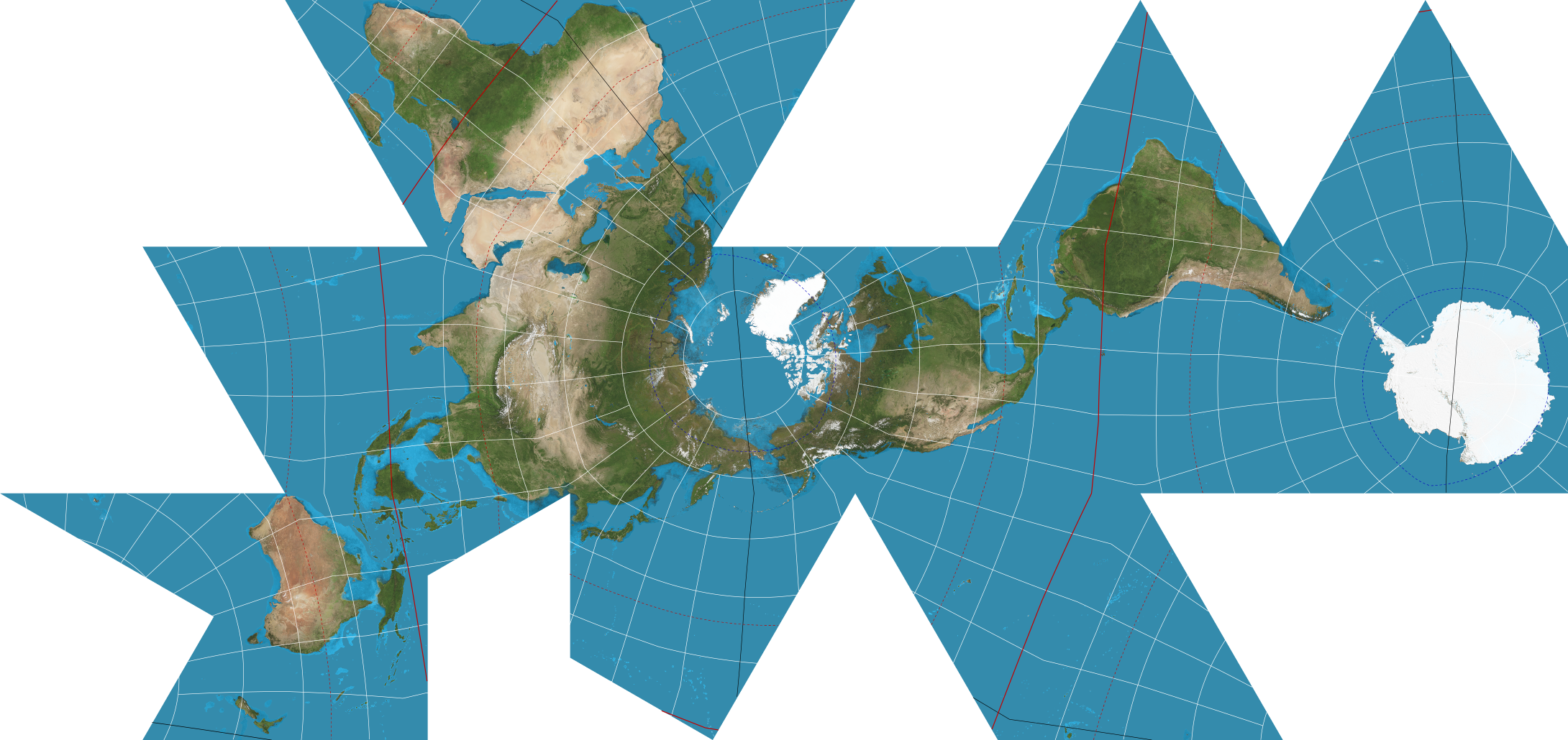
But where is Australia? On the Dymaxion projection, Australia is in the bottom left corner. Is that okay? Recall that one most standard world maps, Australia is in the bottom right corner. Let’s go back to the oblate spheroid. Where is up or down, as well as left or right, on the oblate spheroid? Actually, these terms “up, down, left, or right” are artificial when considering our planet in the solar system. Our planet in space has no real “up” or “down.” The planet is a spheroid in galaxy, in open space.

Consider that astronauts in a space shuttle could maneuver the shuttle anywhere around the planet to provide any number of viewpoints. All of those potential viewpoints would be valid perspectives to look at Earth. However, for centuries maps like the Mercator projection have placed North America and Europe at the top of the map. Thus, Australia is placed near the bottom of the map. In contrast, a few so-called upside-down world maps put the southern hemisphere at the top of the map, with the northern hemisphere at the bottom. For these maps, Australia is on the upper half of the map, sometimes even in the center of the top half.
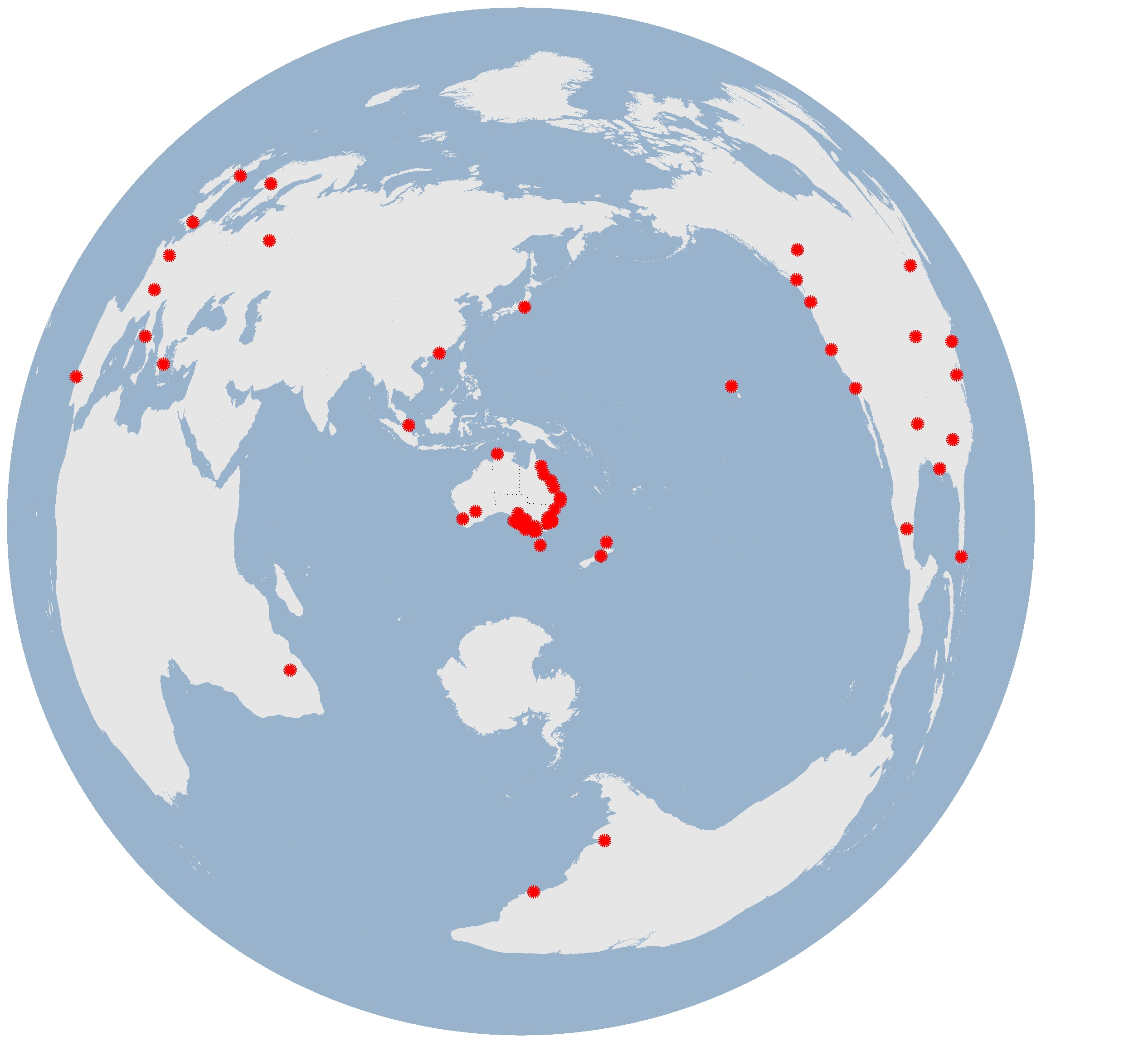
What could happen if Australia was the central focus of the map? For a look, go to http://www.maths.adelaide.edu.au/matthew.roughan/img/azimuthal.png
For geographers, all of these elements of maps are fascinating; however, there may be societal implications as well. Many social scientists contend that the centuries-long practice of placing North America and Europe at the top of the map at least subliminally implies that these places are better than places at the bottom of the map. Think about how many other ways in our culture we consider top better than bottom. Given the colonial power of various northern countries subjugating various southern lands and peoples, some scholars argue that these maps, even a little bit, helped justify this dominance.
Where is Australia? Right where it’s always been, but sometimes in different placements on world maps. How big is Australia? The same size that it’s always been, but sometimes appearing in varying relative sizes and shapes on world maps.
Did You Know?
In author Joel Quam’s murder mystery novel “… or Perish,” the protagonist is given the first name of Mercator, so that the name can be a trigger for discussing features of Geography in the storyline.
In terms of geometry, the Mercator projection is a cylindrical projection.
The five criteria considered in map projections are size, shape, scale, direction, and distance.
Cited and additional bibliography:
Kunimune, Justin. 2018. “Dymaxion Projection.” Wikipedia. https://en.wikipedia.org/wiki/Dymaxion_map#/media/File:Dymaxion_projection.png. Creative Commons Attribution-Share Alike 4.0 International.
